Our half bath is tiny and dated! These small bathroom design ideas will make it feel bigger and wow our guests. Come check out my plans and inspiration!
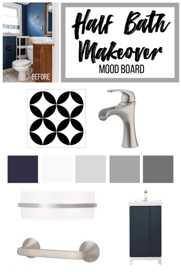
I must be crazy, but I'm tackling ANOTHER bathroom remodel for the One Room Challenge this fall! In just six weeks, I'll transform our tiny, dated half bath into a modern powder room that will wow guests. But first, I need some small bathroom design ideas to inspire me to take on this challenge!
This post contains affiliate links for your convenience. Purchases made through these links may earn me a small commission at no additional cost to you. Please visit my disclosures page for more information.
In my last bathroom remodel, I had to design around the existing almond bathroom fixtures because the huge jetted tub was far too expensive to replace. In a feat of almost super-human endurance, I managed to transform that dated space into a relaxing retreat all by myself in just six weeks!
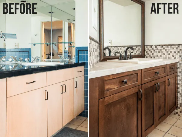
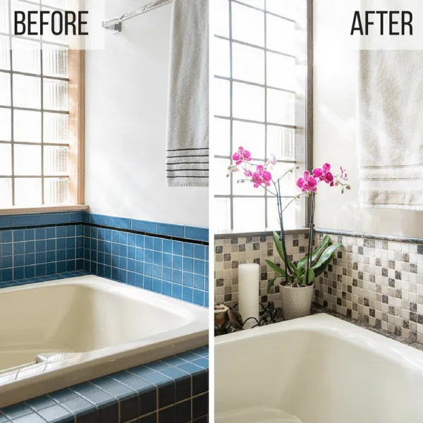
Alas, even though this bathroom is now the nicest one in the house, it's still the one we use the least! Our main bath gets the most action, followed by our teeny-tiny upstairs half bath. That's the one that will be getting a makeover this time around!
Want the Grand Tour?
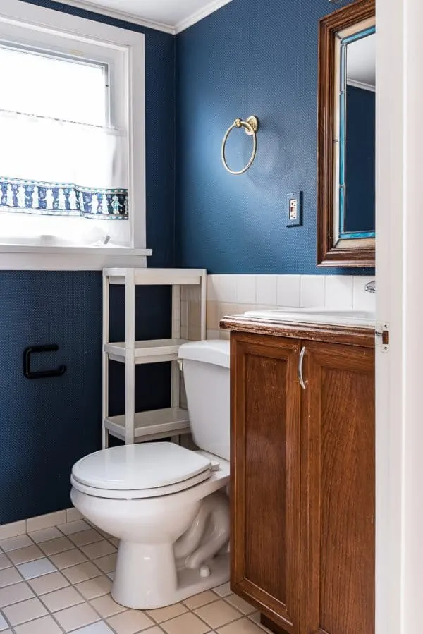
That's it! Oh, so many things are wrong with this picture! Check out the video below for a better look at this small space.
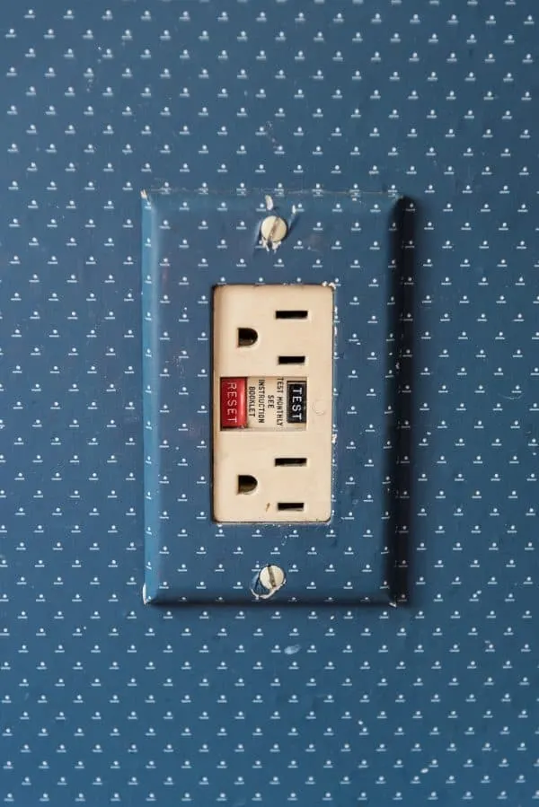
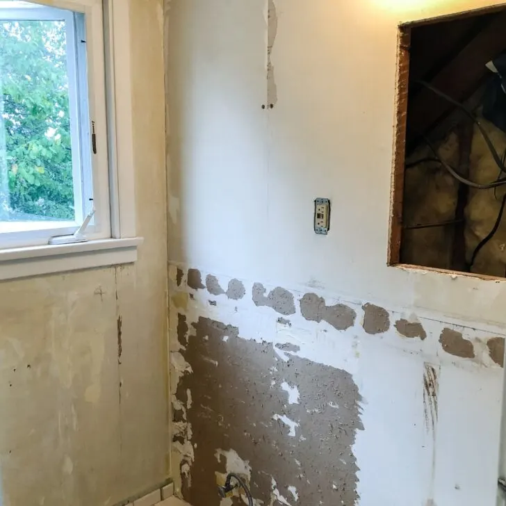
The dark wallpaper makes the space feel even smaller, and if you look at the dots for too long, you'll get dizzy. Someone obviously put a lot of time and effort into trying to make this outlet disappear, but it's not fooling anyone! I can't wait to remove this wallpaper!
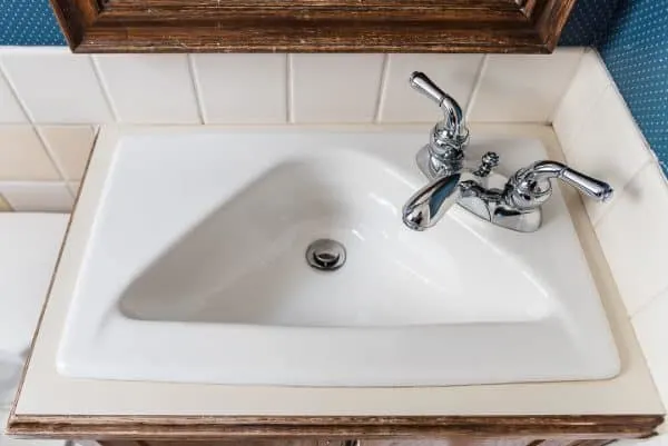
What is up with this crazy triangle sink? It's so small, you can't even get your hands in it to wash up properly! I removed a hexagon sink from the basement bathroom, so I guess the previous owner really liked his geometric shapes!
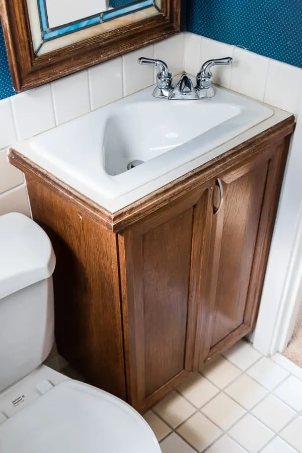
The vanity is missing a door pull, and the wood is worn and water damaged.
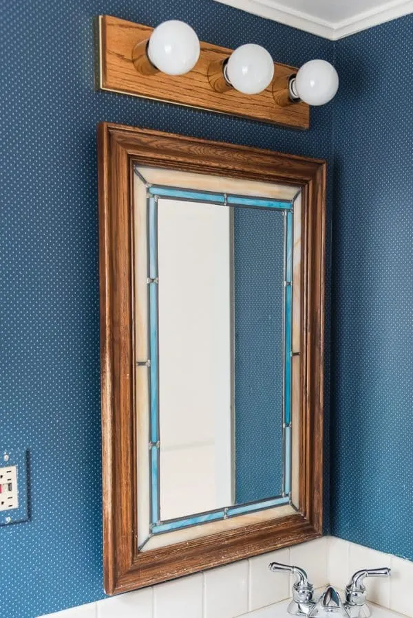
The ceiling in here is pretty low, and it's made even lower by the position of the mirror on the medicine cabinet. You have to crouch down just to see the top of your head!
There's also a lot of damage to the wood on the side where it's been opened and closed all these years. And don't even get me started on that hideous light fixture!
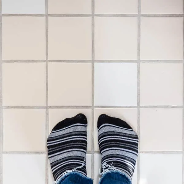
The tile floor is in good shape, but the tan and white color scheme needs an update.
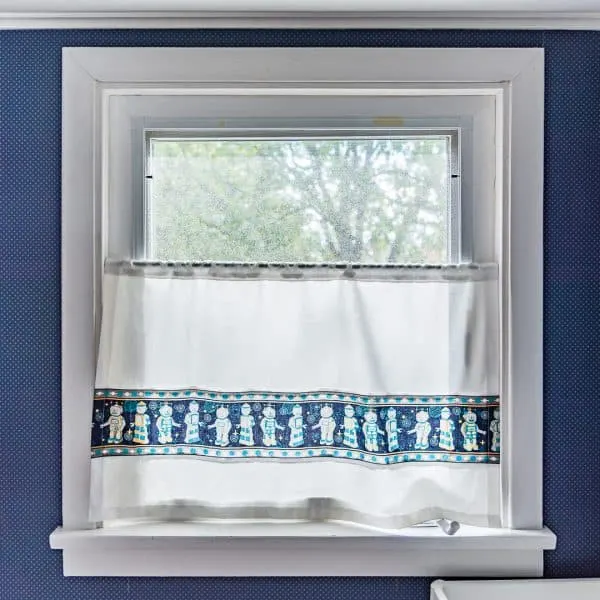
Like the robot curtains? We needed a privacy curtain in a hurry when we first moved in, so I cut down an old one from our son's previous bedroom. It's still there four years later!
Small Bathroom Design Ideas
There's plenty of things you can do to make a small bathroom feel larger. Our powder room measures just over six feet square, so I need all the help I can get!
Add pattern
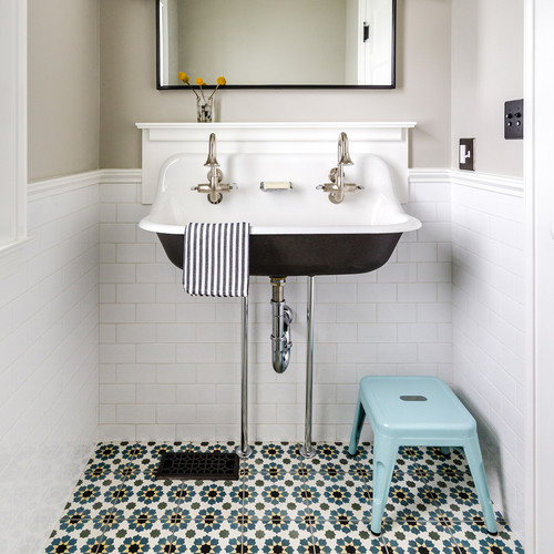
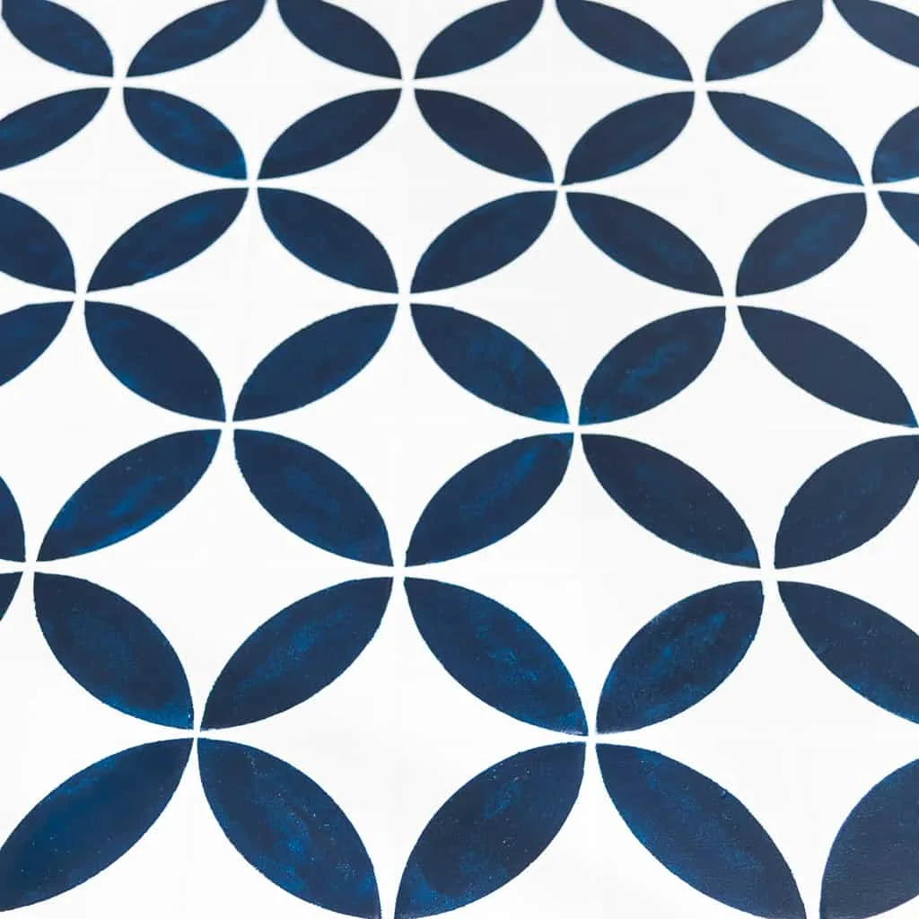
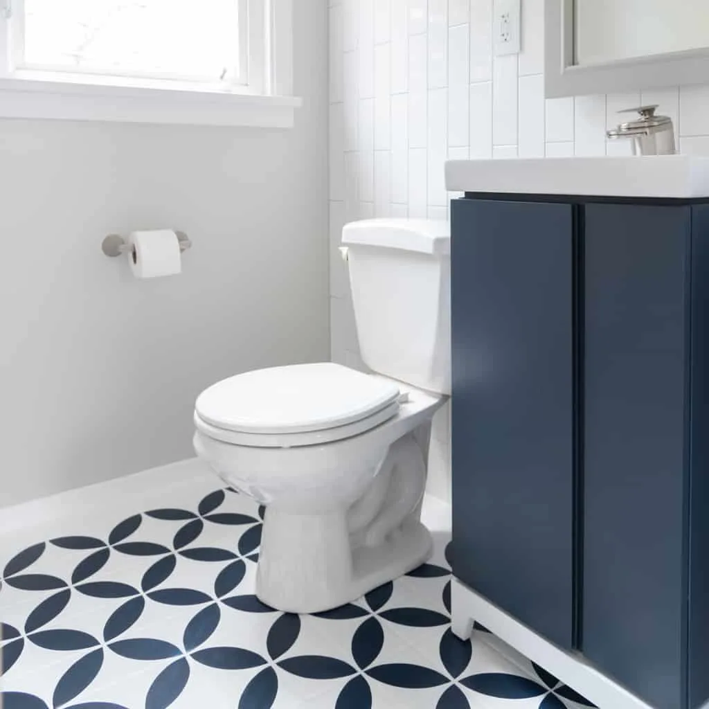
A striking tile pattern on the floor will draw the eye to every corner of the room, making it feel bigger.
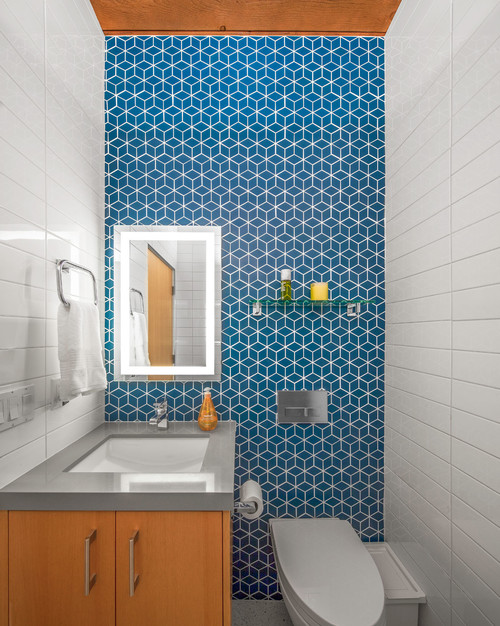
Adding pattern to the back wall gives it depth. If there weren't a window in our bathroom, I would be all over this look!
By keeping the rest of the small bathroom design simple, the pattern takes center stage! Hand painted ceramic or cement tiles are pricey, so I plan to use a stencil and floor paint to create the same effect.
Free Up Floor Space
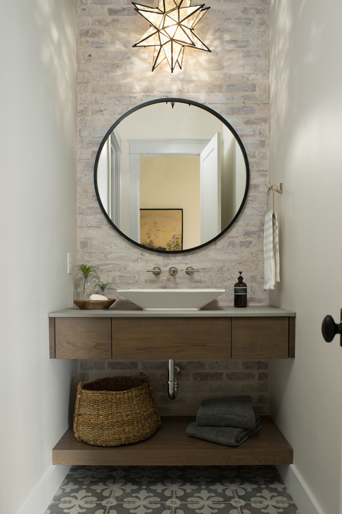
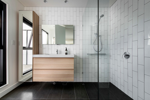
Keeping the vanity up off the floor gives it a lighter appearance, and shows off the tile underneath. Pedestal sinks are the traditional way of minimizing floor coverage, but they lack storage. A vanity with tall legs or a floating vanity gives you the storage you need with the same effect.
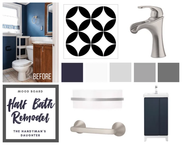
I'm hoping the tile under the old vanity is in good shape so I can continue the stencil design all the way to the wall. The new vanity I chose has feet to elevate it off the ground, and is narrow enough to fit in the existing space.
White with a Pop of Color
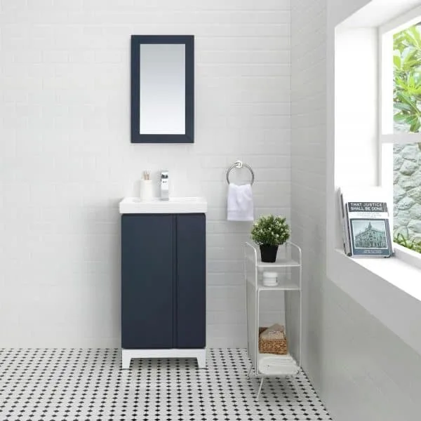
It's true what they say about white making a space look larger than it actually is. But a stark bathroom can look sterile and boring. Balance white walls with a darker element like this vanity to ground the space and give a small bathroom more visual interest.
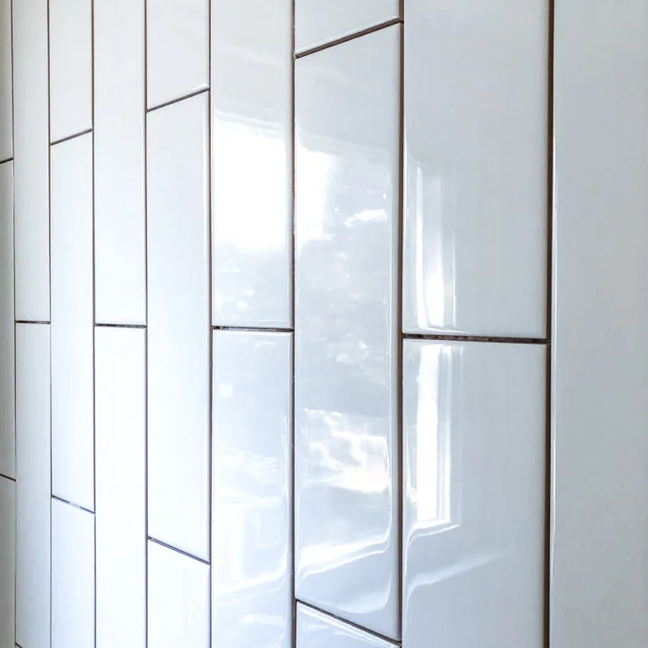
I'm planning to install vertical subway tile up the wall behind the sink and toilet. This will give our height-challenged room the illusion that it's taller while protecting the wall from splashes.
Clean Lines Keep Visual Clutter to a Minimum
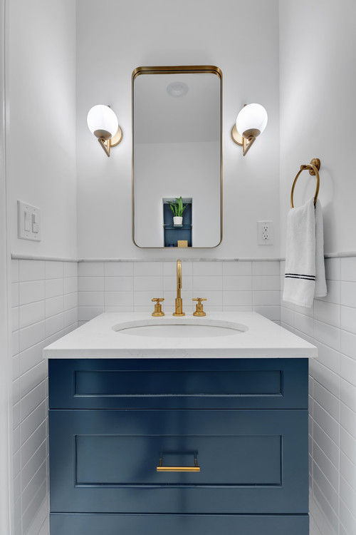
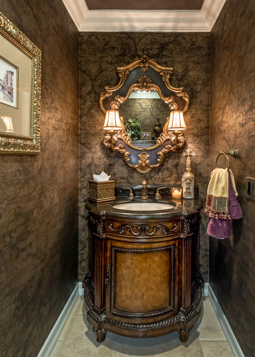
We all know that clutter can make a room feel smaller. But an overly ornate vanity or light fixture can also contribute to the same problem.
Wow. That's a whole lot of look!
There's so much going on, the eye doesn't know where to focus first. Keep the details to a minimum to really make them pop!
I'll be sticking to a simple color palette for this small bathroom. Just white, dark blue and a touch of gray! By incorporating all these small bathroom design ideas into the space, I'm hoping it will feel much bigger.
I'm so excited to get started! Follow along as I show you how I turned this ugly little half bath into a sleek, modern space!
Check out the rest of this half bath makeover!

Sherry
Wednesday 17th of October 2018
Gorgeous looks! Thanks for sharing at Home Sweet Home!
Jann Olson
Saturday 13th of October 2018
Lots of great inspiration! Thanks for sharing with SYC. hugs, Jann
Amy
Friday 12th of October 2018
Can I just tell you that you are crazy! You remind me so much of me when I was a few (OK several) years younger. I can't wait to see this project when you get it done!
Denise
Friday 5th of October 2018
LOVE your design ideas! This is going to be a great transformation! I'm excited to watch it unfold :)
Jess
Friday 5th of October 2018
This is going to look amazing! I love your inspiration photos!